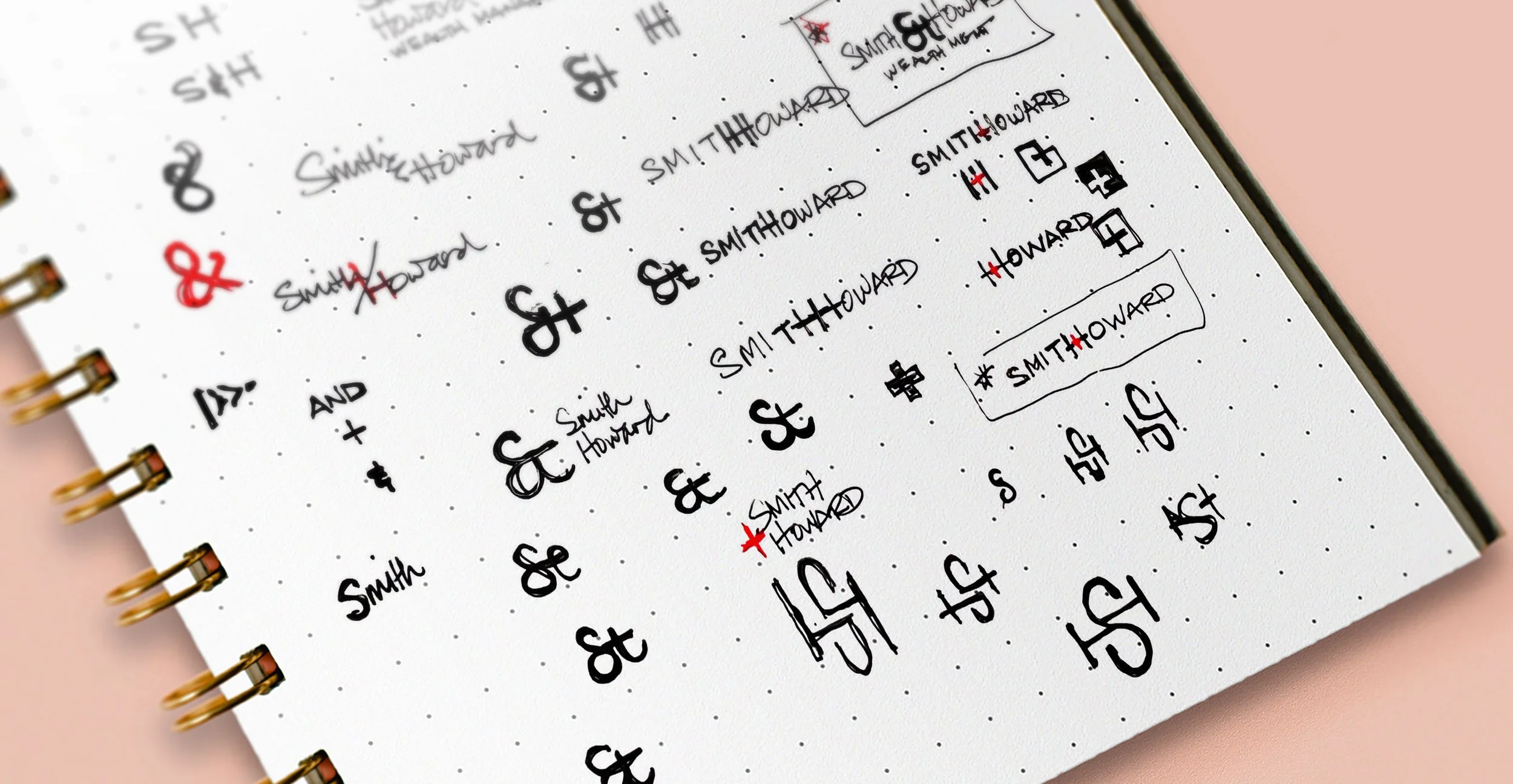
Smith + Howard Branding
As the Smith + Howard family of brands approached their 50th anniversary, their evolution over the years justified a more modern, nationally recognized set of brands.
—
My Role: Lead VisID Designer and Digital Creative Lead

The goal of Smith + Howard’s new logo and visual identity system was to reflect their high-quality suite of services, excellent customer relationships and commitment to values and their community.
While their existing brand logo (below, left) certainly built equity in the Atlanta community over 50 years, it was time to reimagine their brand to more accurately represent who they are currently and where they want to be in the future.

I started out with three options for their new logo mark and included mockups of the accompanying collateral pieces to help visualize the brand as a system, rather than a single logo mark. After option one was selected, a full brand visual identity and website was created.


Smith + Howard required an in-depth brand style guide that covered the entire visual and tonal gambit.


As the Creative Lead for S+H’s brand redesign, I oversaw all efforts involved in the UI/UX of their main website; smith-howard.com.


