Visual Designer | Brand Identity & UX/UI Design
Group 26.png

PAL

Brand Identity

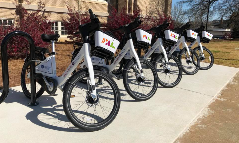
Embarking on a rebrand, Play. Advocate. Live Well. (PAL) sought a new visual identity that captured the breadth of their work and community impact. As pillars of the Spartanburg, SC. community, their new branding had to position PAL as champions of a healthy lifestyle, promote active living, healthy eating, and foster health equity for all.

My Role: Lead Brand Identity Designer

Each letter icon represents one actionable item that PAL stands for.

Each letter icon represents one actionable item that PAL stands for.

PAL-logo-2.png
Once aligned on the visual direction, a logo mark was created.

Once aligned on the visual direction, a logo mark was created.

P-lay: Looks like a bouncing ball, or the tread of a shoe— an abstract object in motion.

P-lay: Looks like a bouncing ball, or the tread of a shoe— an abstract object in motion.

A-dvocate: Made up of 2 shapes: The smaller shape is not propping up the larger shape, but it's there and ready to support if  it's needed.

A-dvocate: Made up of 2 shapes: The smaller shape is not propping up the larger shape, but it's there and ready to support if  it's needed.

L-ive Well: When rotated CCW, it resembles open arms and the shape of a heart. This represents the outcome of living well— peace and joy.

L-ive Well: When rotated CCW, it resembles open arms and the shape of a heart. This represents the outcome of living well— peace and joy.

pal-shirt.png
pal-bikes.png